Join communities on Sidechat Download
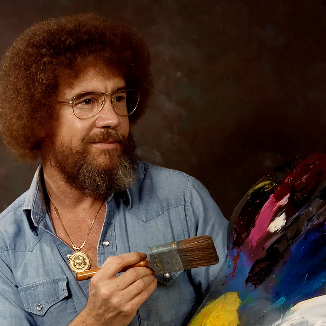
Hello all. Here are my two variations of my drawing (other in the comments). I can’t decide on the color of the face so if you have opinions gimme. 
 15
15 
Anonymous 22w
Anonymous 22w
I absolutely love the coloring on the first one, but the coloring on the second one seems to fit more with the over all piece. That’s just my opinion though!! :D
Anonymous 22w
i think my favorite depends on what you’re going for. the second option looks more realistic, but the color choices in the first option give a beautiful hint of abstractness or impressionism? idk if i’m using the words right lol
Anonymous  #1 22w
Thank you. Not answer is wrong on this lol. The first coloring is what it started as but i was messing with the colors at the end and was like oh that looks good too.
Anonymous OP 22w
Yeah the purplish hue seems like the “right” color but the blue or other hue I feel like could add something to the emotion you’re trying to portray maybe.